
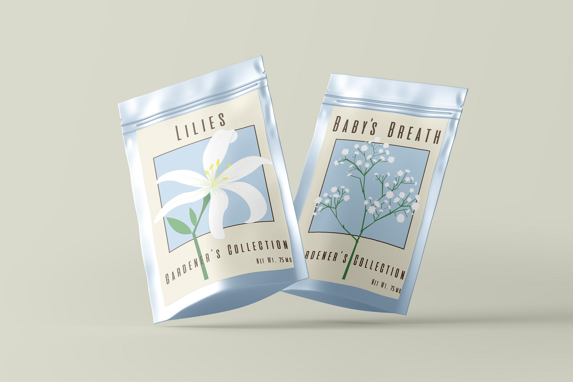
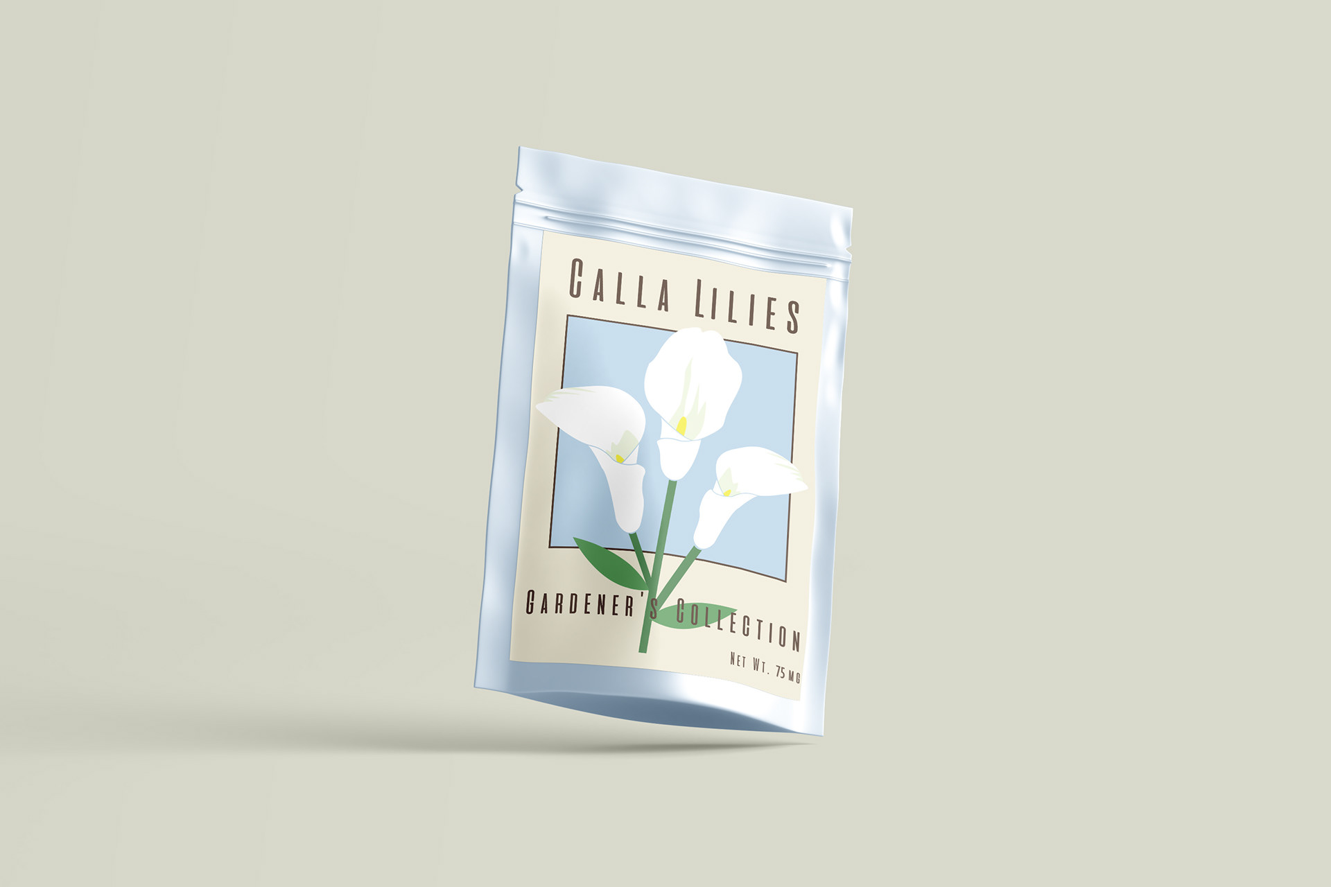
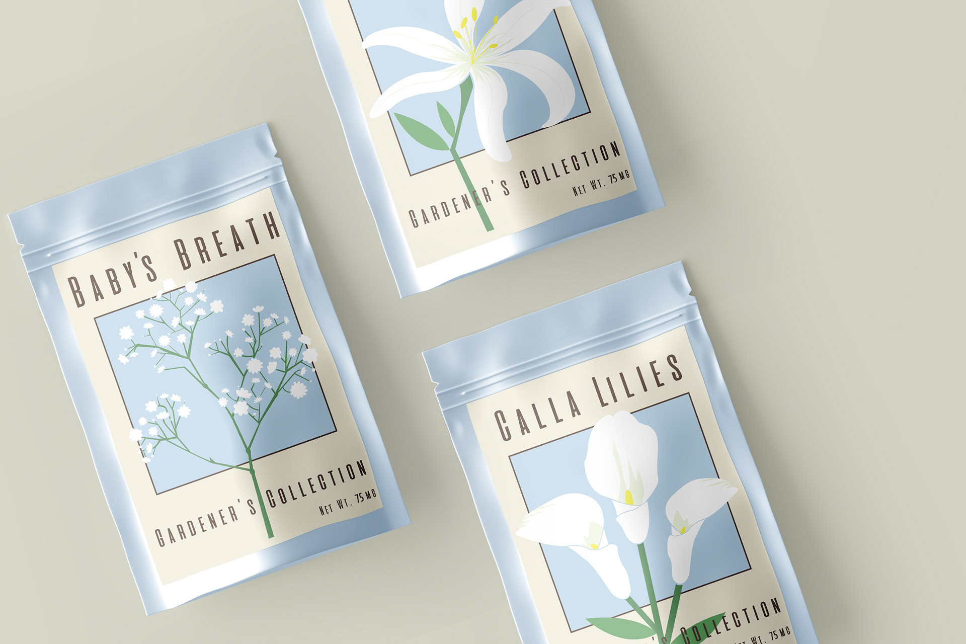
When it comes to branding, simplicity can go a long way. Sometimes bold colors and shapes aren’t necessary to show the personality traits of a brand and its values. For this project, I wanted to explore what a simplistic flower brand would want their packaging to look like. Instead of vibrant images and loud typography, I opted for pastel colors and simple shapes to provide a fresh and natural look for the brand.